BudgetQuest
Simplifying financial planning through education and engagement
Responsive Dashboard Design
Project Type
Concept Design
Project Duration
4 weeks
User research, Ideation, Wireframes, Prototyping, Usability Testing, User Interface, Design Library
Case Study Contents:

Problem
Maintaining consistent expense tracking and budgeting is a challenge for many people in forming a long-term financial management habit.
Current budgeting apps often feature uninspiring interfaces and lack motivational features, leading to user abandonment and hindering individuals from achieving consistent financial management.
Solution
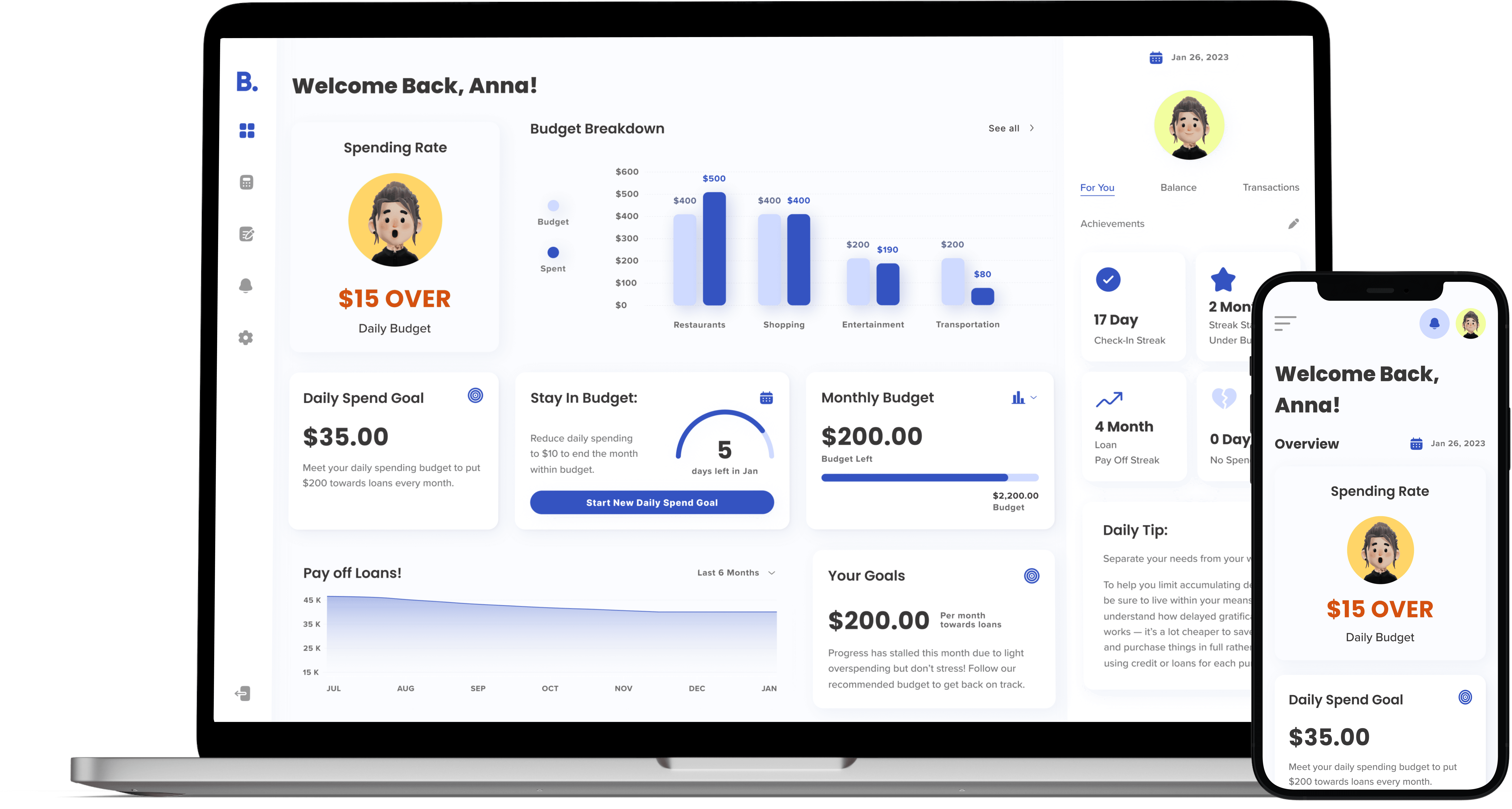
An expense tracking and budgeting dashboard that uses education and engagement to help users form healthy financial habits and reach their financial goals.
01
Meet your financial goals
Use of sophisticated algorithms to analyze your financial data and provide insights, trends, and recommendations
Considering factors like spending patterns, income fluctuations, historical data, and financial goals to offer personalized advice

02
Encouraging Habits and Engagement
High level of user interactivity through customizable achievement badges foster engagement and encourage healthy habits surrounding meeting your financial goals
Daily tips to further improve your financial literacy and dive deeper into healthy financial planning

03
Data Aggregation and Integration
Data aggregation from various sources, such as bank accounts, credit cards, bills, and income streams
BudgetQuest will gather and consolidate this data, ensuring accuracy and up-to-date information


Understanding the user
What methods do young adults use to track their daily spending and navigate long-term financial goals, and why do these methods sometimes fall short?
Method // 6 interviews conducted over zoom

“Money causes a lot of anxiety, so the less I look at it or think about it the better I feel.”
Fueled by significant anxiety and guilt surrounding their finances, participants exhibited a more passive management style, often avoiding budgeting or proactive financial check-ups.

“I didn't have the time to manually type in how much I spent on each category so I just stopped using it.”
Over 70% of participants reported abandoning previous financial planning platforms. They found these platforms to be tedious and lacking features that addressed their specific needs.

"It's frustrating because I know I should limit certain spending, but I lack a clear budget. I just eyeball it, and then end up surprised when I go over."
Unable to set a foundational budget, participants rely on guesswork to estimate spending, leading to inaccurate budgeting and feelings of surprise when exceeding limits.

“Even though I keep track of all my spending. I don't really realize how much I spent on each category”
Although they might be tracking their spending, the information isn't presented in a way that provides insights. There is a need to go beyond simple data entry and offer meaningful categorization and analysis of spending habits.
Competitive Analysis
Competitor solutions lack opportunities for engagement and connection.
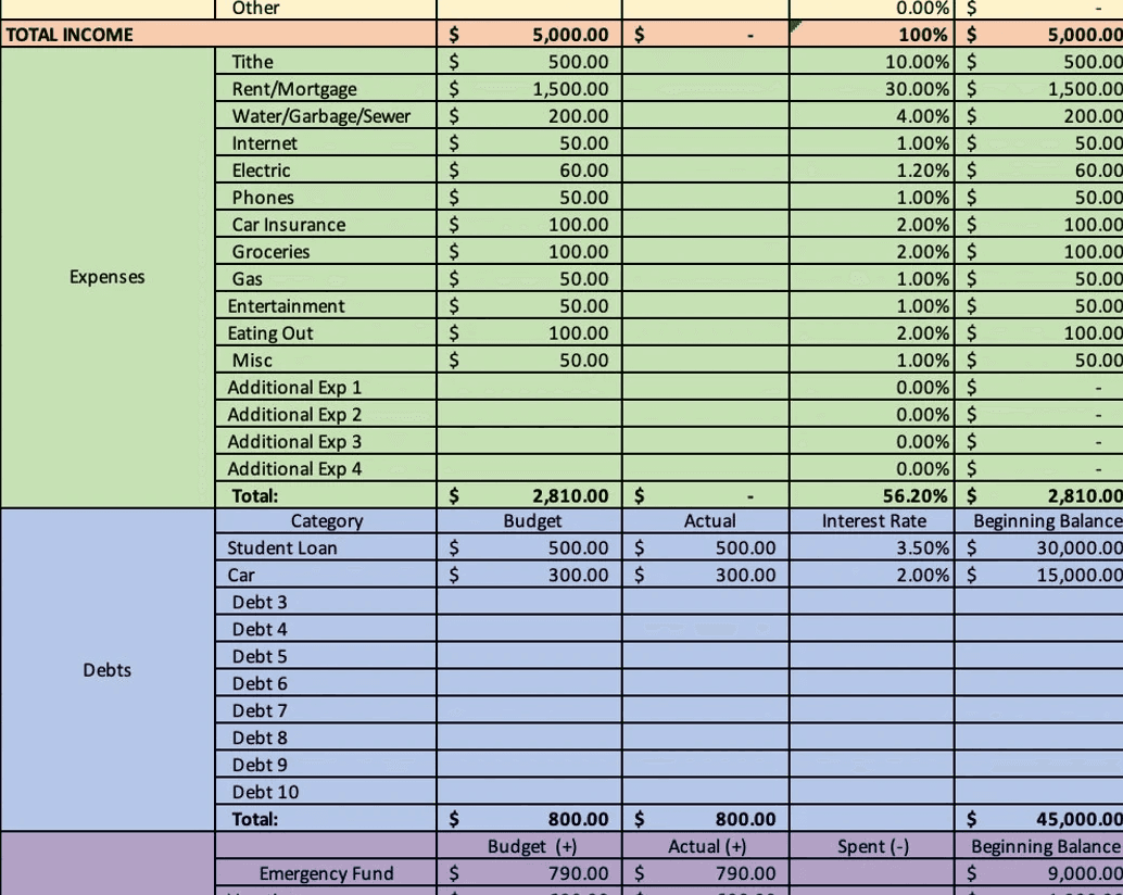
Top competitor financial planning services’ main feature of the platform are either after the fact tracking or budget planning; either utilizing a complete hands-off approach or tedious hands-on inputing. These platforms lack a personable quality that would make beginners feel more comfortable with an already scary topic.


While analyzing these competitors I often asked myself:
How are they keeping people engaged? What if I’m completely new to financial planning?
View Full Competitor Analysis
Defining the Solution
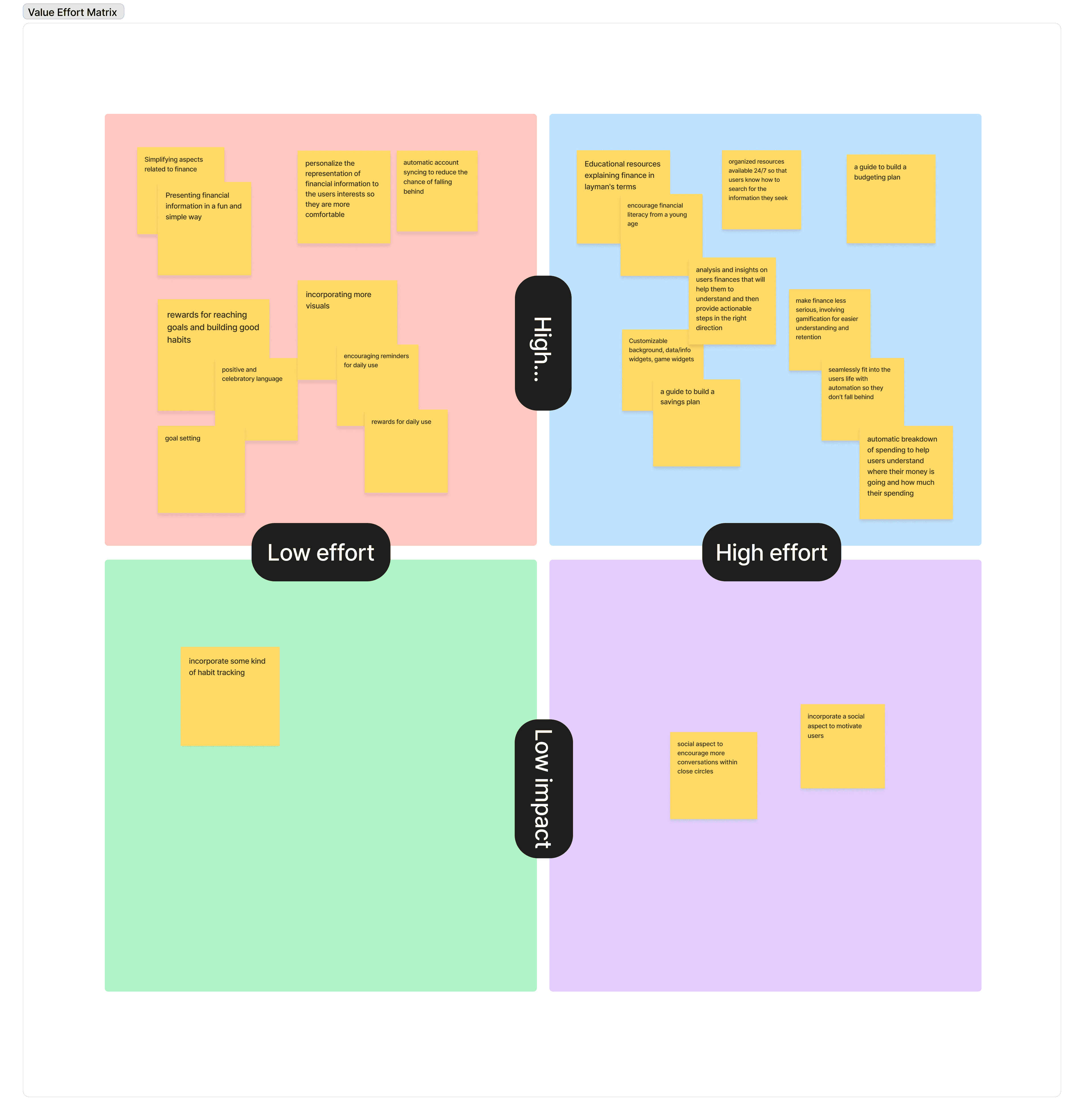
For the scope of the project I focused on the main dashboard screen and created a value effort matrix to define the MVP.
Wireframes
Navigating the dashboard design through Lo-Fi iterations
With no prior exposure to data analytics dashboards, I began by working through multiple iterations of Lo-Fi Wireframes in order to understand the information architecture, data visualization, and design patterns of digital dashboards. Each widget addresses user paint points, frustrations, and wishes observed during user interviews.
Style Guide
Injecting life into the Lo-Fis
The user-friendly dashboard combines inviting colors and a simple layout, creating a visually appealing experience for those intimidated by finance. With a style guide emphasizing comforting yet exciting hues, I hope to alleviate anxiety, build trust, and foster enthusiasm for financial literacy.

design system
The hidden UX behind the widgets
Through the main dashboard, users will encounter a diverse range of experiences within the main front-facing widgets. I had to consider the various states of each widget based on users interactions and inputs, so I created a design system to help maintain consistency and scalability across the widgets.
Usability Testing & Iterations
Major improvements to the final design
I conducted usability tests to evaluate the design and gauge the effectiveness of the data visualization, IA, and UI. Based on the feedback, I made three major improvements to the design:

Improve Visual Hierarchy and UI
Usability test participants stated the design had a lot of colors and they had a lot of trouble trying to figure out where to look first.
I decided to implement a more simple and comprehensive color palette and refined the typography styles for better UI.

Information Architecture and a simpler dashboard
Users found the previous version overwhelming with a lot of information at once.
Reducing copy and opting for more data visualization, as well as scaling back on amount of content on the dashboard helps to give the user better focus.


Re-evaluating Content
Widgets such as the Optimize Tip and Budget Details felt unnecessary to users, and participants voiced information they would have liked to see instead.
I re-evaluated each widget to make sure they were in line with the users’ goals and provided a solution to their problems.
Final Solution
Final Thoughts
What I learned
This project was a new challenge for me because I was unfamiliar with the common design patterns and UX due to having no prior experience with dashboards, unlike other applications like mobile apps in which I have been exposed to experience daily. I took a lot of extra time understanding data visualization and dashboard design in order to better understand the solution I wanted to build and how. This project gave me more confidence and experience in working through unfamiliar territory as I learned to take one step at a time and learn through the process.
