Poshmark
Designing a new feature within Poshmark’s search function.
Native Mobile App
Project Type
Concept Design
Project Duration
4 weeks
My Role: Sole Researcher & UX Designer
User research, Ideation, Wireframes, Prototyping, Usability Testing, User Interface, Design Library
Case Study Contents:
The Problem
Users encounter difficulty in finding desired items promptly and efficiently on Poshmark, resulting in frustration and lengthy search sessions.
The goal of this project was to discover and tackle any user pain points within Poshmark’s search experience. Based on research findings, I discovered that users found image and link input an intuitive search method, yet this feature is not available on Poshmark.
The Solution
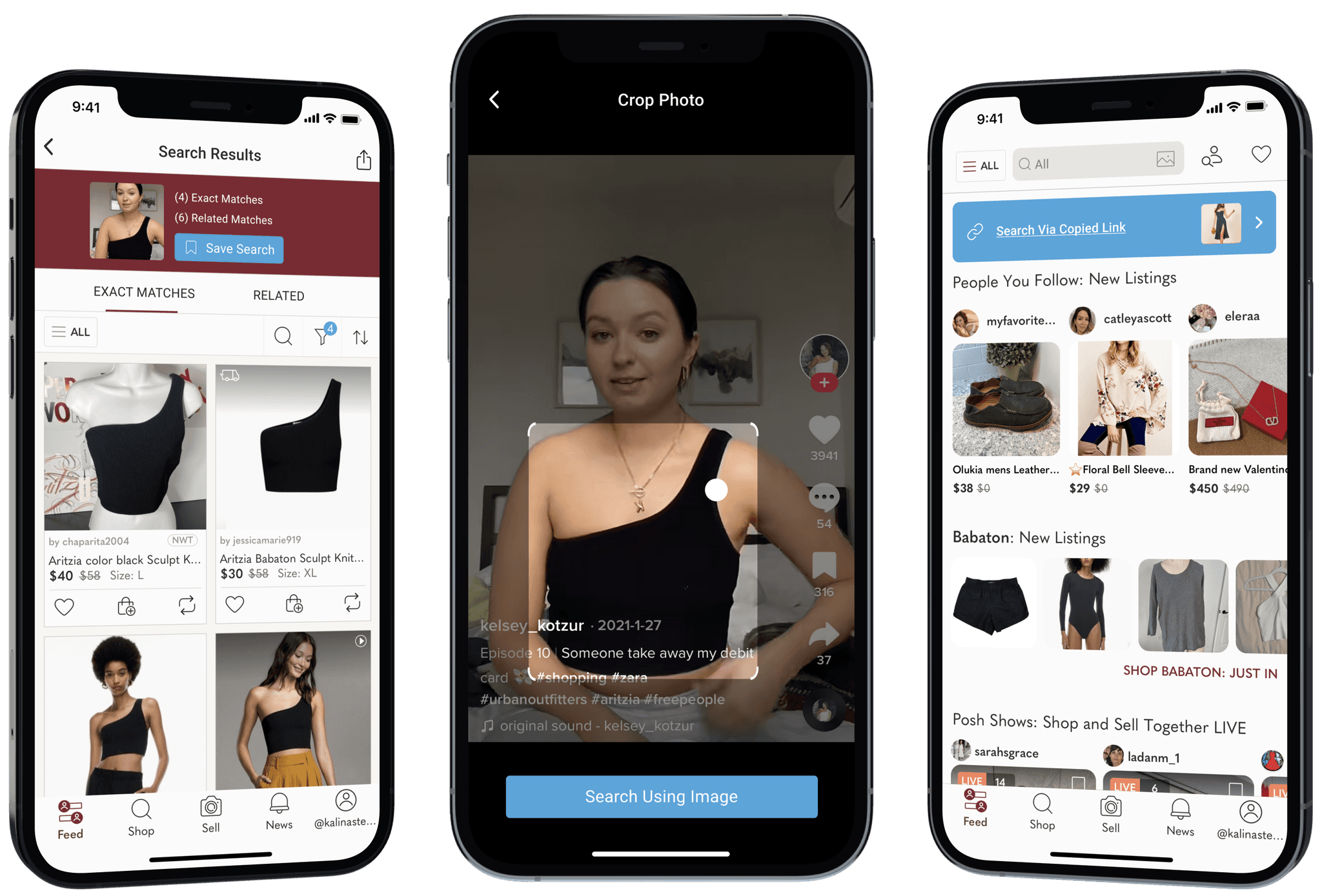
Enabling users to perform reverse image searches and input direct links to improve search accuracy and efficiency in order to enhance users' search experience on the Poshmark app.
01
Reverse Image Search
Users can now skip painstaking keyword and filtering to get the specific items they are searching for, instead uploading an image and allowing Poshmark to yield visual matches.
02
Live Link Search
Quickly and easily search listings by inputing a live link. Find exact items with item names, descriptions, brand, color, and product pictures taken from the product page.
Discovery Research
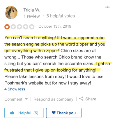
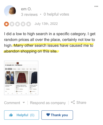
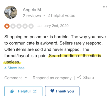
Search Function Limitations: Users commonly report issues with Poshmark's search functionality.
As a long-time user of Poshmark, I am very familiar with my own experience using the app; to make sure I wasn’t injecting my own bias, I first took to reading reviews left by users on the app store to see if I could identify any recurring pain points.
“You can’t search anything!”…”I get so frustrated that I give up on looking for anything!”
Competitive Analysis
Poshmark's opportunity for differentiation can propel them ahead of competitors, fostering increased competition in the market.
I conducted a competitive analysis to audit the search features within Poshmark’s top competitors (Mercari, Depop, ThredUp, Google Shopping) and understand Poshmark’s current standing in the market.

ThredUp

Mercari

Depop

Google Shopping
Key Takeaways
Insight #1
All competitors rely on keyword input and filtering to yield search result.
Insight #2
All competitors lack in utilizing all features to enhance users' search experience, whereas Poshmark has included all features on their platform
Main Takeaway
Though Poshmark is ahead of their competitors with more personalized search features, all platforms rely on the same method of search, this is an opportunity for Poshmark to change the way users search, further differentiating their unique shopping experience from their competitors.
View Full Competitor Analysis
User Interviews
User interviews revealed common frustrations with the search function and users desire for alternate search methods.
To see if these pain points still caused friction for current users, I recruited 5 participants to conduct user interviews and better understand the Poshmark user experience.
Research Method
Research Objectives
Research Questions
Key Insights
Insight #1
80% of users have a pattern of cross-referencing sites while shopping in order to find a cheaper deal
Insight #2
80% of users felt annoyed and frustrated when searching for an item, stating results didn’t match what they were searching for, and that unrelated items will show too making the search longer than it needs to be.
View Affinity Map Results
User Persona
To consolidate my research and start to narrow down on the user’s needs and pain points I created a user persona to help define the problem and drive future design decisions.
“I wish there was a faster way to search for specific items, I get tired of sifting through unrelated listings.”

Full User Persona
Defining the solution
How might we improve the way users search for items to yield more accurate results faster?
Reverse Image Search
Users can input an image to search listings for items with visual matches.
Live Link Search
Users can paste live links to quickly and accurately search currents listings for in season items.
Site Map and User Flows
Having defined a solution, I produced a sitemap for the current platform to understand where the new function would integrate, and designed user and task flows to establish how users would access these capabilities and the crucial screens required.
View Site Map and User Flows
Wireframes
With the key frames mapped out, I first created Mid-Fi prototypes and did a preliminary usability test with friends and family to reveal any potential pain points in the design before moving to Hi-Fi.
Adapting to existing branding
The feature will seamlessly fit into the app matching all styles and design expectations. Without access to the official design system, I recreated and matched all necessary components needed for the design.
Usability Testing & Iterations
I conducted a final round of usability tests to validate the design and ensure all flows are smooth and intuitive. Feedback from my usability tests had revealed two main areas for iterations.
“It was a simple task, I liked that you can search by photo! I can see myself using this feature.”
Final Solution
Final Thoughts
What I learned
Moving forward, continuous monitoring of user feedback and analytics will be valuable to further refine and optimize the search experience. This project demonstrates the significance of user-centered design and the positive impact it can have on user satisfaction and engagement. By focusing on users' needs and pain points, Poshmark can continue to evolve its search capabilities and solidify its position as a leading social marketplace in the fashion industry.
