Velosaty Design System
Creating a design system for an early stage startup
Project Duration
Jan 2024 - Ongoing
Team
4 Product Designers
My Role: Product Designer
UX Design, UI Design, Design System
Context
Velosaty is a New York based start-up dedicated to aiding the next generation of athletes in navigating their academic and professional journeys.
Joining Velosaty's 4-person UX team as a Product Designer, I knew design consistency would be crucial for our mentoring platform. One of our top priorities became building a robust design system to aide our future growth.
Case Study Contents:
When I joined the team, every new page we designed was built from scratch, leading to many inefficiencies: buttons had different styles, navigation wasn't uniform, and maintaining consistency became a constant struggle.

"Is this component from an old design or did you make a new one?"
"Wait, is this button using our primary color?"

The
Problem
Increased design iterations to achieve consistency
Disjointed user experience due to lack of design standards
Slower development cycles
The Goal
Anticipating future growth, we recognized the limitations of our existing design system in facilitating a scalable platform. To ensure a seamless user experience for a growing user base, we established the following goals for the new design system:
Establish design consistency
Improve documentation
Enhance efficiency
Enable scalability
The Outcome
describe the impact

01
Meet your financial goals
Use of sophisticated algorithms to analyze your financial data and provide insights, trends, and recommendations
Considering factors like spending patterns, income fluctuations, historical data, and financial goals to offer personalized advice

02
Encouraging Habits and Engagement
High level of user interactivity through customizable achievement badges foster engagement and encourage healthy habits surrounding meeting your financial goals
Daily tips to further improve your financial literacy and dive deeper into healthy financial planning


03
Data Aggregation and Integration
Data aggregation from various sources, such as bank accounts, credit cards, bills, and income streams
BudgetQuest will gather and consolidate this data, ensuring accuracy and up-to-date information
Research & Audit: Understanding Design Needs
To get a clear picture of our design landscape, we focused on two areas of research:
UI Audit: We conducted a thorough UI audit of Velosaty's existing platform and design system. This involved meticulously examining all user interfaces, identifying patterns, and pinpointing inconsistencies.
Competitive Analysis: We analyzed design systems employed by industry leaders in UX and design. This provided valuable insights into industry best practices and potential solutions.
The UI audit revealed a significant challenge – a lack of design consistency across the platform. Here's a breakdown of our key findings:
Multiple Design Variations: Our platform exhibited a multitude of design variations. Buttons had a plethora of styles, navigation elements lacked uniformity, and color usage was inconsistent.
Branding Inconsistencies: We identified instances of incorrect logo usage and color deviations from our established brand guidelines.
Lack of Standardization: The audit revealed a concerning absence of design standards. Designers were relying on personal preferences or copying elements from past iterations, leading to a patchwork of design styles.
Development
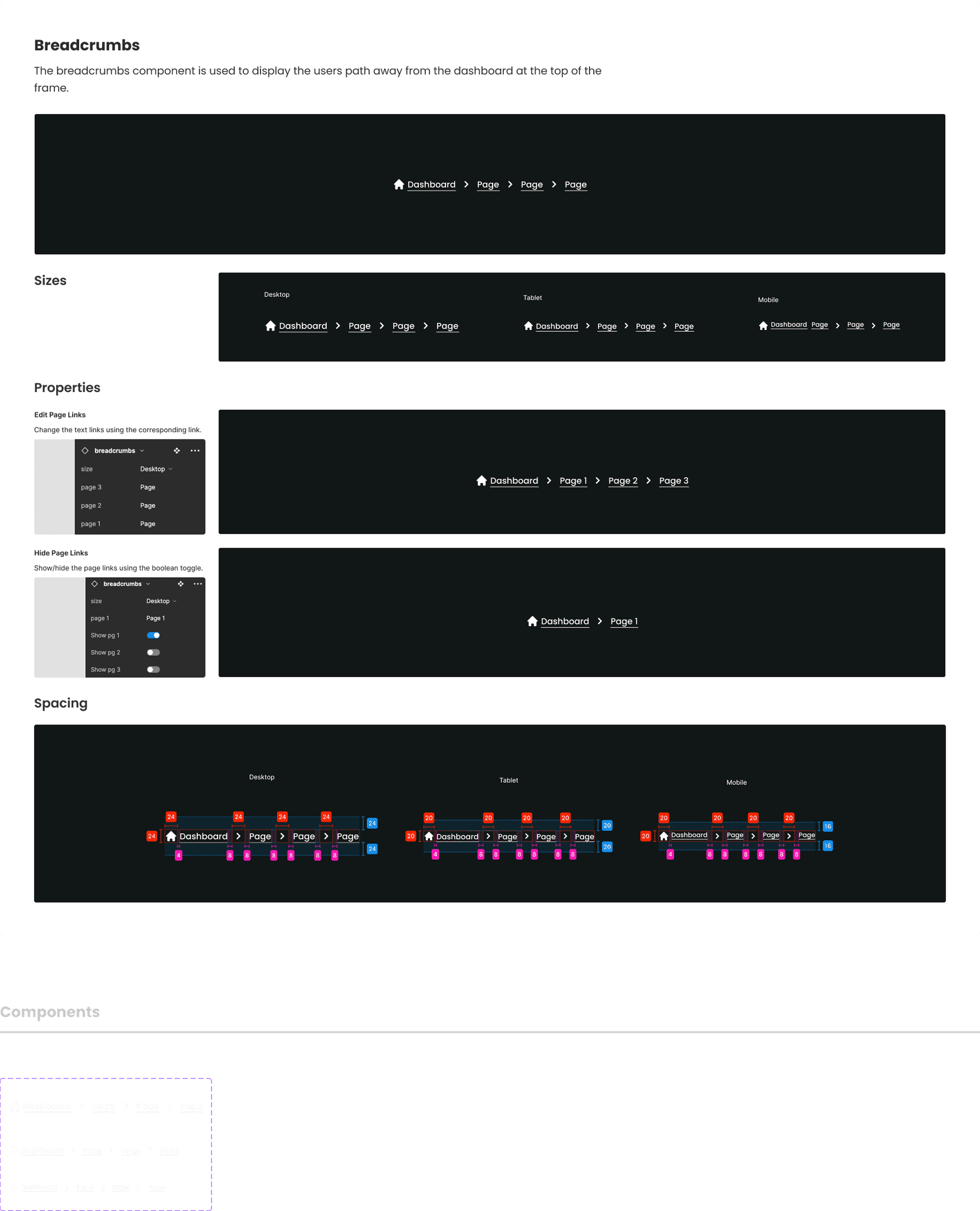
We adopted a building-block approach, prioritizing the development of foundational elements first. This meant establishing the core design tokens and styles before moving on to the creation and optimization of individual UI components. This ensured a cohesive and consistent design language throughout the system.
Standardization of Styles and Tokens: We began by laying the groundwork with a comprehensive style guide. This involved establishing a core set of design tokens (colors, fonts, spacing) and ensuring consistent application across all UI elements.
Typography and Grid System: We defined a standardized typography system, including font families, sizes, and line-height for headings, body text, and other elements. Additionally, we established a modular grid system to guide layout and spacing within the platform.
Next, we conducted a meticulous audit of existing UI components.
Inventorying Components: We identified and documented all components currently used within the platform.
Prioritization and Optimization: We prioritized the development of essential components like buttons, forms, and typography for initial rollout. Components deemed less critical were either streamlined or slated for future updates.
Leveraging Reusable Styles: We ensured all components were built using the newly established design tokens and styles, promoting consistency and maintainability.
Efficiency through Inspiration:
Given our team's size, we embraced efficiency by drawing inspiration from established design systems like Polaris. We borrowed elements that aligned with our needs and adapted them to fit our platform's specific functionalities. This approach significantly accelerated our development process compared to starting entirely from scratch.
Implementation
Rolling out the design system involved equipping both designers and developers with the necessary knowledge and resources. We prioritized thorough documentation that covered:
Usage Guidelines:
Clear instructions on where and how to use each component, along with best practices and examples.
Design Rationale:
The reasoning behind specific design choices, fostering a deeper understanding of the system's purpose.
Component Behavior & States:
Detailed explanations of how components behave under different conditions (hover, active states, etc.) and their interactions with other elements.
Impact
Since implementing the design system, it has played a key role in the design, development, and launch of the platform:
Standardization & Efficiency
We now have a clear set of design standards that ensures consistency across the platform. This has significantly improved design efficiency, allowing us to move from wire-framing directly to hi-fi mockups in the ideation stage.
Enhanced Collaboration
A shared design language fosters better communication and collaboration between designers and developers, ensuring everyone is on the same page visually and functionally.
Scalability for Growth
The modular design system provides building blocks that can be easily adapted and expanded upon as our platform grows and evolves.
Streamlined Development
Developers have a centralized source for all UI components, with instant access to updates and code snippets. This eliminates the need to reinvent the wheel and frees up development time.

Velosaty Design System
Creating a design system for an early stage startup
Project Duration
Jan 2024 - Ongoing
Team
4 Product Designers
My Role: Product Designer
UX Design, UI Design, Design System
Context
Velosaty is a New York based start-up dedicated to aiding the next generation of athletes in navigating their academic and professional journeys.
Joining Velosaty's 4-person UX team as a Product Designer, I knew design consistency would be crucial for our mentoring platform. One of our top priorities became building a robust design system to aide our future growth.
Case Study Contents:
When I joined the team, every new page we designed was built from scratch, leading to many inefficiencies: buttons had different styles, navigation wasn't uniform, and maintaining consistency became a constant struggle.
"Is this component from an old design or did you make a new one?"
"Wait, is this button using our primary color?"
The
Problem
Increased design iterations to achieve consistency
Disjointed user experience due to lack of design standards
Slower development cycles
The Goal
Anticipating future growth, we recognized the limitations of our existing design system in facilitating a scalable platform. To ensure a seamless user experience for a growing user base, we established the following goals for the new design system:
Establish design consistency
Improve documentation
Enhance efficiency
Enable scalability
The Outcome
describe the impact
01
Meet your financial goals
Use of sophisticated algorithms to analyze your financial data and provide insights, trends, and recommendations
Considering factors like spending patterns, income fluctuations, historical data, and financial goals to offer personalized advice
02
Encouraging Habits and Engagement
High level of user interactivity through customizable achievement badges foster engagement and encourage healthy habits surrounding meeting your financial goals
Daily tips to further improve your financial literacy and dive deeper into healthy financial planning
03
Data Aggregation and Integration
Data aggregation from various sources, such as bank accounts, credit cards, bills, and income streams
BudgetQuest will gather and consolidate this data, ensuring accuracy and up-to-date information
Research & Audit: Understanding Design Needs
To get a clear picture of our design landscape, we focused on two areas of research:
UI Audit: We conducted a thorough UI audit of Velosaty's existing platform and design system. This involved meticulously examining all user interfaces, identifying patterns, and pinpointing inconsistencies.
Competitive Analysis: We analyzed design systems employed by industry leaders in UX and design. This provided valuable insights into industry best practices and potential solutions.
The UI audit revealed a significant challenge – a lack of design consistency across the platform. Here's a breakdown of our key findings:
Multiple Design Variations: Our platform exhibited a multitude of design variations. Buttons had a plethora of styles, navigation elements lacked uniformity, and color usage was inconsistent.
Branding Inconsistencies: We identified instances of incorrect logo usage and color deviations from our established brand guidelines.
Lack of Standardization: The audit revealed a concerning absence of design standards. Designers were relying on personal preferences or copying elements from past iterations, leading to a patchwork of design styles.
Development
We adopted a building-block approach, prioritizing the development of foundational elements first. This meant establishing the core design tokens and styles before moving on to the creation and optimization of individual UI components. This ensured a cohesive and consistent design language throughout the system.
Standardization of Styles and Tokens: We began by laying the groundwork with a comprehensive style guide. This involved establishing a core set of design tokens (colors, fonts, spacing) and ensuring consistent application across all UI elements.
Typography and Grid System: We defined a standardized typography system, including font families, sizes, and line-height for headings, body text, and other elements. Additionally, we established a modular grid system to guide layout and spacing within the platform.
Next, we conducted a meticulous audit of existing UI components.
Inventorying Components: We identified and documented all components currently used within the platform.
Prioritization and Optimization: We prioritized the development of essential components like buttons, forms, and typography for initial rollout. Components deemed less critical were either streamlined or slated for future updates.
Leveraging Reusable Styles: We ensured all components were built using the newly established design tokens and styles, promoting consistency and maintainability.
Efficiency through Inspiration:
Given our team's size, we embraced efficiency by drawing inspiration from established design systems like Polaris. We borrowed elements that aligned with our needs and adapted them to fit our platform's specific functionalities. This approach significantly accelerated our development process compared to starting entirely from scratch.
Implementation
Rolling out the design system involved equipping both designers and developers with the necessary knowledge and resources. We prioritized thorough documentation that covered:
Usage Guidelines:
Clear instructions on where and how to use each component, along with best practices and examples.
Design Rationale:
The reasoning behind specific design choices, fostering a deeper understanding of the system's purpose.
Component Behavior & States:
Detailed explanations of how components behave under different conditions (hover, active states, etc.) and their interactions with other elements.
Impact
Since implementing the design system, it has played a key role in the design, development, and launch of the platform:
Standardization & Efficiency
We now have a clear set of design standards that ensures consistency across the platform. This has significantly improved design efficiency, allowing us to move from wire-framing directly to hi-fi mockups in the ideation stage.
Enhanced Collaboration
A shared design language fosters better communication and collaboration between designers and developers, ensuring everyone is on the same page visually and functionally.
Scalability for Growth
The modular design system provides building blocks that can be easily adapted and expanded upon as our platform grows and evolves.
Streamlined Development
Developers have a centralized source for all UI components, with instant access to updates and code snippets. This eliminates the need to reinvent the wheel and frees up development time.